Showing posts with label Watercolor. Show all posts

SEEN THE USA - 5

Some time ago I had painted a series of old cars and I decided to look back at them to compare to this old Chev, to see if I felt that progress has been made.

So, for the swan song of this painting, here is another old rusty Chev that was done some years ago for comparison to the new Chev.


I’m not really sure that I’ve made any painting progess – I still like the old one!

What do you think?

SEEN THE USA - 4

Well, now I’m starting on the background – first coat of light washes.
More work on the background. Can this still be ruined??? Why, of course it can!
My thought was to layer miskit and paint, gradually building up the darker colors.
I also added some vegetation around the car.
At the end of this process, I hate the background. After removing the miskit it looks too “scratchy” to me. I may try more paint, or some collage or . . . it’s a do-over (which is the direction I’m leaning).
I had such high hopes for this one. Oh well, lesson learned. I’m very happy with the car itself, though!

SEEN THE USA - 3

I'm baaaaaaaaaaack from my annual painting retreat - didja miss me????

While I was gone, I worked on the old Chev some more.

Here more rust has been added – on the trunk . . . .


. . . . and top.


Here is a close up of the rust.

IRIS - FINAL

I puttered with the flowers and buds and sharpened them a bit.
Then a loose, washy background and the painting was completed.

IRIS - 1

This was a demo painting for a class. As you can see, I began with the main iris stem crossing another, and then decided I didn’t like it.

I completed the iris, and then redrew the stem going more straight down.

EMERGING - FINAL

I applied some salt to the background in the final wash of dark green.

After paint was applied to all areas, the masking tape and miskit were removed.
I loosened just a bit of the paint in a few areas to create shadow areas, and the painting was complete.

This worked out better than I had anticipated!

Emerging, Watercolor, 22x15

EMERGING - 1

This painting is an experiment in taping, but was begun by miskiting the white areas.

Then a blend of yellow was poured loosely in the areas I anticipated keeping yellow.

Tape was applied, rather than miskit, on each successive layer, building up the darks.

GEORGIA WATERCOLOR SOCIETY

Now I can sign it . . . .

. . . since I just earned my Signature (status) from Georgia Watercolor Society! Yippee!!

I’m very excited, and honored (especially since the other person just earning his signature in the Society is none other than Laurin McCracken.  I’m in no way comparing my abilities to his, far from it; but, wow, it’s exciting to me to think that I’ve got something in common with him!

GWS has a point system: ½ pt. for a members’ show and 1 point for a National Exhibition. And, all of their shows are juried, so it doesn’t matter whether you are a member, you still might not get into the shows. Well, over the past couple of years I have entered 4 paintings which have been accepted into 2 national and 2 members’ shows! Since there are always different judges, and I never bribed any of them (ha, ha) I have concluded that maybe I can paint.

I’m aware that some artists do not want to participate in pursuing signature status in any of the watercolor societies, believing that it is elitist and/or political. But, it’s only human nature to want to know “where we stand”. Having your painting hanging on the wall next to other artists’ work is one of the best ways to figure that out. As far as I’m concerned, achieving signature status is a validation of an artist’s skills and hard work.

In any event, I’m very happy about this and just wanted to share with you.

This was one of those paintings that I loved from the start. In other words, very rare!

I “painted” it in my head first, and it was beautiful! Then came the hard part – actually painting it!

Once I had decided on this subject – a photo taken a few years ago at the local farm show – I cropped and enlarged the photo. Then I decided to use watercolor, full sheet.

I have found that the paintings that I work out in my head and take my time with usually turn out the best. Gee, planning and execution – who woulda thunk it!

Industrial Revolution, watercolor, 22x30.

SHAKER FAST FOOD - 4


Here is a list of colors used in this painting – do you think it was too many??? By my count, there are 28 colors listed below! I just don’t understand that “limited palette” idea!

Table - Sepia, Van Dyke brown, quin gold deep (limited), monte amiata
Background and areas on the various cans - Hooker’s green, sap green, thalo blue and thalo turquoise
Beets - Quin magenta, perylene maroon
Lima beans - hooker’s green
Tomato – quin sienna, perylene scarlet, quin gold deep (limited)
Cans - sodalite
Also – appearing in a supporting role – quin gold, indanthrone blue (seems I can’t paint a painting without these two!), quin. burnt orange, permanent brown, permanent lemon yellow, arylide yellow, aureolin yellow, Venetian red, Indian red, French ultramarine, raw sienna, cobalt teal, cobalt blue, cerulean blue
Most of these colors are from Daniel Smith.

Shaker Fast Food, watercolor on Arches 300#, 15x22

SHAKER FAST FOOD - 3

Some might call this “paint by number” and they would probably be right! But I am enjoying the challenge to get the colors similar to what is in the photo. This is not photorealistic (like Jacqueline Gnott or Laurin McCracken)  but as close as I’m able to get! I thoroughly enjoy these detailed paintings. Maybe because I can paint a small area and while it’s drying I can start dinner or switch the laundry and by the time I’m back the painting has dried enough for me to continue working.
Another layer of paint over the words.

More work on the cans.  I decided to do the labels first since they are so detailed, and then I’ll do the cans all together and then I’ll mix up some black for the lettering and labels.

I have never done a painting this detailed before. I even had to buy a “0” round brush for all those little spaces and letters!
I enjoy seeing this painting come to life!

SHAKER FAST FOOD - 2

These cans were set up on an old table in a dining area and the colorful labels caught my eye. It was a revelation to me that they had canned goods “back in the day”! (This is the source of the painting’s name). I’ll have to do some research on this! So this painting captures both a happy memory and a little slice of history in a colorful way!
I applied the miskit on the words, which took several hours! I used the miskit since I want to remove the graphite before I apply the last layer of paint to the background. When I remove the miskit it will take off most of the graphite and then I can erase any residual before I apply that last background layer.

I put on a few layers of green and blue over the background.
Then I began layering on browns in the table area.

Then I started on the cans.

SHAKER FAST FOOD 1

We always have a reason to create a painting and viewers want to know that reason. If you follow this blog you know that I have painted some still lifes which incorporate items left to me by my mother and grandmother; simple items that, while not worth much monetarily, have sentimental value for me. I’m told that those paintings tell a story and go beyond just seeing the objects. If so, that’s great, but I don’t usually paint with a deep psychological bent; I just paint things that have meaning for me and if that comes through to the viewer, all the better.

This particular painting is one of what I hope to be a series of paintings from my trip to Shaker Village at Pleasant Hill in Harrodsburg, Kentucky last year with Rhonda Carpenter and another friend. (To see another painting composed from that trip go here .  It was the first time we had traveled together so I was a little concerned how it would work out. Turns out there was no cause for concern – the three of us had a blast! – and I got some decent photos to work from.
Here are the cans drawn out - the edges were taped so that when I added the words I wouldn’t accidentally trace them over the cans.

BRUSH-PAPER-WATER BLOG

I'm happy to announce that my work is being featured over at Chris Beck's "Brush-Paper-Water" blog!  I consider this a huge honor.
Chris makes me look good!  Go take a look at what she has to say on both her blogs!
"I'm Painting as Fast as I Can"
"Brush-Paper-Water"

HYDRANGEA - 4

Finally, more darks to the background.
Not great, certainly not frame-worthy! But probably a do-over in the future because I really like the idea; just didn’t get down on paper what’s in my head!

HYDRANGEA - 3

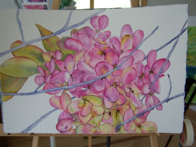
Then it was time to tie some of this together, since I think it looked too haphazard with each flower part painted separately, although I liked the look. So I began deciding which parts went together and giving more shade and depth to the flowers, and then added more color to the stems.

HYDRANGEA - 2

After I had the flowers completed (or so I thought) I added the stems. Then I realized that the flower was almost a ball which did not look good, so I added a few more flowerettes (is that what you call it on a flower like a hydrangea or a lilac???)

HYDRANGEA - 1

This is an attempt to utilize some of the info I learned at the Nick Simmons w/s this spring.
I am using the “cell painting” idea – painting each little area by itself. I love doing this although it takes a while!

IT'S A DILEMMA! - 2

Well, I’m not unhappy with this one, but not sure what to do with the background.
My husband says to make a “mansion” in the background with a driveway sweeping down toward the car; my friend says if I do that she will never speak to me again! What’s a gal to do??? I think this one may sit a while and/or never be completed!

(I should have thought it through to the end but was just wanting to do an old shiny car – oh well . . . . . )

You know how some folks call their paintings “Untitled” (which bugs me!!). Well, guess I could call this one “Unfinished”!!!

UNFINISHED OLD BLUE ’31 FORD, watercolor, 15x22

ROSES - 4

The purpose of this exercise was for the students to build layers and shadows for deep, rich color.
All of the students did a great job!

As an aside - this Friday is the ViewPoint opening so, needless to say, I'll be more than a little busy all week, so I'll put up a post this weekend or beginning of next week, that will deal with the show.

Hope that those of you who live in the Greater Cincinnati area will be able to either attend the opening or visit the show while it hangs!

ROSES - 3

The red rose is layers of the same colors as the coral rose (Quin. gold, Quin. coral and Quin. rose) with some Quin. red, Quin. magenta and ??? (I forget!!!). Again, indanthrone in the shadows.
The green in the stems is Quin. gold, sap green, indanthrone blue and various combinations of those colors.
I softened some areas when they were dry to fade some of the hard edges.