Showing posts with label painting instruction. Show all posts

SEEN THE USA - 5

Some time ago I had painted a series of old cars and I decided to look back at them to compare to this old Chev, to see if I felt that progress has been made.

So, for the swan song of this painting, here is another old rusty Chev that was done some years ago for comparison to the new Chev.


I’m not really sure that I’ve made any painting progess – I still like the old one!

What do you think?

SEEN THE USA - 4

Well, now I’m starting on the background – first coat of light washes.
More work on the background. Can this still be ruined??? Why, of course it can!
My thought was to layer miskit and paint, gradually building up the darker colors.
I also added some vegetation around the car.
At the end of this process, I hate the background. After removing the miskit it looks too “scratchy” to me. I may try more paint, or some collage or . . . it’s a do-over (which is the direction I’m leaning).
I had such high hopes for this one. Oh well, lesson learned. I’m very happy with the car itself, though!

SEEN THE USA - 3

I'm baaaaaaaaaaack from my annual painting retreat - didja miss me????

While I was gone, I worked on the old Chev some more.

Here more rust has been added – on the trunk . . . .


. . . . and top.


Here is a close up of the rust.

SEEN THE USA - 2

Starting to add the rust.

This old car was in a cow pasture down in Tennessee.  A friend and I ventured "off the beaten path" to get some photos.  Fortunately, we live to tell the tale!

SEEN THE USA - 1

Finally – an artful post! Oh well - slow but sure.

However, due to my schedule, I may not be posting often for the next couple of weeks or so, but promise to have more soon.

Here is a little more on the car I began for the art club demo.  I am going to post this as I work on it; usually I "edit" my posts so you just get the better, but I'm taking a chance with this one!   I'll have more next week.
As a refresher – here is the start.


I’ve added some raw sienna on the body of the car and some (I think) cobalt (or maybe french ultramarine??) and manganese hue in the windows.

DEMO

The beginning of my demo.
The last couple of weeks (in between bouts of dizziness and doctor visits) I spent some time working up paintings in fluid acrylics for a demo for an art club that I belong to. Any time I give a demo I worry that the audience will be bored, or that I won’t be clear in my presentation. But the group seemed to enjoy the presentation and I had some audience participation so I know they weren’t asleep!

Since there was less than an hour for the presentation, and since I paint at the speed of a slug racing a snail, I decided to do work on more than one painting (at home) so that I could show them different processes and possibilities for their own paintings, should they want to try fluid acrylics. And, this time, I decided to work on paintings that I am really interested in bringing to completion for myself, rather than a generic painting for show and tell.

In the beginning there was a very wet sheet of paper . . . .
During the demo, I began one painting, showing them my usual process, then went on to show some paintings in process, and by then the time was up!

. . . that became the start of a painting . . . .
Besides some favorable comments on my paintings, I think they also liked my apron which I made years ago. It says “So little time, so much to paint”!
I have no idea why I was waving this painting around?????
Yep, that’s me standing in front of the group looking so gorgeous, don’t you think! Make especial note of the hair, since I’m trying to let it get a bit longer; it’s in that weird stage of not short enough to be bangs but just long enough to curl into your eyeball, so I have to keep it clipped back. Oh yeah, quite stylin’!

Like I always say, the only reason my friends keep me around is to make them look good in comparison!
Here is the start of an old car.  I had painted a series of old cars many years ago and when I saw this one in a field in Tennessee I had to take it's photo.  I've got high expectations for this one, but, as always, we shall see!

IRIS - FINAL

I puttered with the flowers and buds and sharpened them a bit.
Then a loose, washy background and the painting was completed.

IRIS - 1

This was a demo painting for a class. As you can see, I began with the main iris stem crossing another, and then decided I didn’t like it.

I completed the iris, and then redrew the stem going more straight down.

GEORGIA WATERCOLOR SOCIETY

Now I can sign it . . . .

. . . since I just earned my Signature (status) from Georgia Watercolor Society! Yippee!!

I’m very excited, and honored (especially since the other person just earning his signature in the Society is none other than Laurin McCracken.  I’m in no way comparing my abilities to his, far from it; but, wow, it’s exciting to me to think that I’ve got something in common with him!

GWS has a point system: ½ pt. for a members’ show and 1 point for a National Exhibition. And, all of their shows are juried, so it doesn’t matter whether you are a member, you still might not get into the shows. Well, over the past couple of years I have entered 4 paintings which have been accepted into 2 national and 2 members’ shows! Since there are always different judges, and I never bribed any of them (ha, ha) I have concluded that maybe I can paint.

I’m aware that some artists do not want to participate in pursuing signature status in any of the watercolor societies, believing that it is elitist and/or political. But, it’s only human nature to want to know “where we stand”. Having your painting hanging on the wall next to other artists’ work is one of the best ways to figure that out. As far as I’m concerned, achieving signature status is a validation of an artist’s skills and hard work.

In any event, I’m very happy about this and just wanted to share with you.

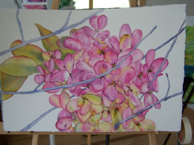
This was one of those paintings that I loved from the start. In other words, very rare!

I “painted” it in my head first, and it was beautiful! Then came the hard part – actually painting it!

Once I had decided on this subject – a photo taken a few years ago at the local farm show – I cropped and enlarged the photo. Then I decided to use watercolor, full sheet.

I have found that the paintings that I work out in my head and take my time with usually turn out the best. Gee, planning and execution – who woulda thunk it!

Industrial Revolution, watercolor, 22x30.

YUPO PROBLEMS

If you follow this blog you know that I’m not a fan of the Yupo paper. Just recently I was reminded again of why!
A friend was preparing a drawing on a piece of Yupo. It was a cold winter day, but the sun was out and she had taped the drawing and Yupo onto a COLD window to use in the manner of a light box. She took a lunch break and went back to the drawing – to find that her lines were no longer matching up. At first, she thought the tape had come loose, but – it turns out that the Yupo paper had gotten just warm enough to s-t-r-e-t-c-h a bit from the slight warmth of the sun! She immediately laid the paper on a table to cool off, but damage had been done. She decided to simply eliminate a portion of the (very involved) drawing and simply make the painting smaller.
So, sorry you Yupo-ites – you STILL can’t convince me that this is a good surface to work on!

SHAKER BASKETS - 3

I then gessoed that whole area and then repainted it. In the end, the white line is pretty well camouflaged. In the close up you can also see some places where the paint got “outside the lines” of the board and handle. Those spots were also cleaned up and camouflaged, and here is the final result. The white acrylic on the top of the shelf is showing up quite white in this photo; in real life it doesn’t show up that white!


Shake ‘er Baskets, 15x30, Fluid Acrylic on canvas

SHAKER BASKETS - 2

Here is a close up of the basket as it develops.

At the art club demonstration, I continued building up the colors. Then I laid this painting against the wall (upside down) and took out another painting to work on. I thought this one was dry, but it wasn’t! Not until I was packing up did I realize that the basket handle had been wet and the brown paint had run into the background. (Top left area just above the basket handle).


I dipped a Qtip into alcohol to rub off the brown paint (see the close up) which also took off some of the cobalt.

SHAKER BASKETS - 1


As you may recall, Rhonda Carpenter and another friend and I went to Shaker Villlage earlier in the year. I came away with a few photos to develop into paintings. This painting is taken from a photo of some old, well used Shaker baskets on top of an old shelving unit. For this horizontal design, I drew the painting onto a 15x30 canvas and began with a light wash of cobalt in the background. Then I used several shades of brown fluid acrylics in light washes.

As you can see (below) I worked left to right and only partially finished each additional layer. I intended to use this painting for demonstration purposes at a local art club and wanted to be able to show my layering process. I gradually built up the colors in the baskets and on the wooden shelf, using my fan brush to create striations to simulate wood on the shelf.

BRUSH-PAPER-WATER BLOG

I'm happy to announce that my work is being featured over at Chris Beck's "Brush-Paper-Water" blog!  I consider this a huge honor.
Chris makes me look good!  Go take a look at what she has to say on both her blogs!
"I'm Painting as Fast as I Can"
"Brush-Paper-Water"

HYDRANGEA - 4

Finally, more darks to the background.
Not great, certainly not frame-worthy! But probably a do-over in the future because I really like the idea; just didn’t get down on paper what’s in my head!

HYDRANGEA - 3

Then it was time to tie some of this together, since I think it looked too haphazard with each flower part painted separately, although I liked the look. So I began deciding which parts went together and giving more shade and depth to the flowers, and then added more color to the stems.

HYDRANGEA - 2

After I had the flowers completed (or so I thought) I added the stems. Then I realized that the flower was almost a ball which did not look good, so I added a few more flowerettes (is that what you call it on a flower like a hydrangea or a lilac???)

HYDRANGEA - 1

This is an attempt to utilize some of the info I learned at the Nick Simmons w/s this spring.
I am using the “cell painting” idea – painting each little area by itself. I love doing this although it takes a while!

IT'S A DILEMMA! - 2

Well, I’m not unhappy with this one, but not sure what to do with the background.
My husband says to make a “mansion” in the background with a driveway sweeping down toward the car; my friend says if I do that she will never speak to me again! What’s a gal to do??? I think this one may sit a while and/or never be completed!

(I should have thought it through to the end but was just wanting to do an old shiny car – oh well . . . . . )

You know how some folks call their paintings “Untitled” (which bugs me!!). Well, guess I could call this one “Unfinished”!!!

UNFINISHED OLD BLUE ’31 FORD, watercolor, 15x22

IT'S A DILEMMA!

I haven’t painted a car for quite a while and thought I’d like to do another one. So I picked this old Ford that I photographed at the local farm machinery show a couple of years ago.
Miskited the whites.
As usual, I began by laying in some thin washes and then zeroing in on one area at a time.